

Table of Contents
Sign-in is often the first moment when a person decides whether a digital service feels dependable. Reviewing examples of login page design can help teams spot common patterns, but the strongest flows do more than look polished. They make each field, choice, and security request easy to understand.
Low friction does not mean removing every safeguard. It means removing wasted effort while preserving the checks that protect an account. A person signing in from a new phone, for example, may accept an additional verification step if the service explains why it is required and what will happen after it is completed.
Table Of Contents
- Why Sign-In Design Matters
- The Parts Of A Clear Sign-In Screen
- Reduce Friction Without Lowering Security
- Make Passwordless Login Easy To Understand
- Write Better Errors And Recovery Messages
- Design For Accessibility And Small Screens
- Measure And Test The Flow
- Common Sign-In Design Mistakes
- A Practical Final Checklist
Why Sign-In Design Matters
Users arrive at a sign-in screen with a simple goal: access their account. Vague prompts, unfamiliar terminology, unexpected redirects, or repeated data entry can make that goal feel harder than it should. In contrast, a calm and predictable experience tells people where they are, what information is needed, and how to get help if something goes wrong.
Useful friction has a visible purpose. Confirming a sign-in from an unfamiliar device may protect the account. Asking for the same email address twice, or forcing a person through an unexplained redirect, usually does not. Design each interruption so users can understand its value before they are asked to act.
The Parts Of A Clear Sign-In Screen
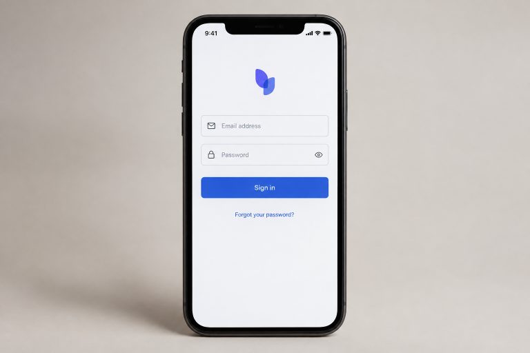
A focused sign-in page needs only the information and actions required for the current step. Start with a direct heading such as “Sign in to your account.” Label the identifier field clearly as “Email address” or “Username,” rather than relying on placeholder text that disappears when users type.
- Use a visible label and an appropriate keyboard type for email fields on mobile devices.
- Include a show or hide control for password fields, so users can check what they entered.
- Use a direct primary button label, such as “Sign in.”
- Keep “Forgot password?” easy to find without giving it more visual weight than the main action.
- Group alternate sign-in methods below the primary route and explain meaningful differences between them.
Reduce Friction Without Lowering Security
Ask for only the information needed at that moment. Support browser autofill and password managers instead of blocking them. Keep the primary action visible on small screens, and avoid clearing an entire form after a single error. These details respect a user’s time without weakening authentication requirements.
If additional verification is necessary, introduce it before the prompt appears. For example, tell users that the service will ask them to approve the sign-in on a trusted device. After verification succeeds, return them to the expected destination rather than forcing them to restart the process.
Make Passwordless Login Easy To Understand
Passwordless sign-in replaces a memorized password with another proof of account access, such as a passkey, a one-time code, a sign-in link, or device-based biometric approval. The terminology matters less to users than a clear explanation of what they need to do next.
Give each method a plain-language explanation
- Passkey: Approve sign-in with a device screen lock, such as a fingerprint, face recognition, or PIN.
- One-time code: Enter a short code sent to an approved email address, phone number, or authenticator app.
- Sign-in link: Open a time-limited link sent to a verified inbox.
Organizations are increasingly focusing on making passkeys easy to discover and use, rather than merely making them available as another option. Recent passkey adoption research from the FIDO Alliance estimated that more than 7 billion passkeys were in use worldwide in October 2026. Even so, every passwordless flow should provide a secure backup route for people who lose access to their usual device.
Write Better Errors And Recovery Messages
Error messages should help a person recover, not make them decode a technical problem. Put the message near the relevant field, identify the issue in plain language, and state the next action. Preserve entered information when it is safe to do so.
- Weak: “Authentication failed.”
- Better: “That email or password does not match an account. Check the details and try again.”
- Weak: “Invalid token.”
- Better: “This sign-in link has expired. Request a new link to continue.”
Recovery deserves the same care as sign-in. Someone who cannot use their normal password, device, or inbox needs a clearly marked path that explains available options without revealing sensitive account information.
Design For Accessibility And Small Screens
Accessible sign-in design improves the experience for everyone. Use visible labels, strong contrast, clear focus states, and controls large enough to tap comfortably. Ensure the full flow works with a keyboard and that error messages are available to screen reader users. Test at larger text sizes and in portrait and landscape orientations.
The refreshed accessible sign-in design guidance from Login.gov highlights larger buttons and text, stronger contrast, and clearer visual hierarchy. Those choices show how visual clarity can support people across devices without adding unnecessary complexity.
Measure And Test The Flow
Start with a baseline for completion rates, failed attempts, recovery requests, and time to account access. Then identify where people leave the flow or repeatedly request help. Usability sessions should include common scenarios, such as signing in on a new device, using a password manager, entering an expired code, and recovering an account.
Test on older phones, narrow browser windows, tablets, and desktop computers. Change one major part of the experience at a time when evaluating results. A cleaner sign-in page is not a full success if recovery remains confusing.
Common Sign-In Design Mistakes
- Hiding password reset or recovery options below the fold.
- Using different names for the same field across sign-in and recovery screens.
- Presenting several equal-looking buttons without explaining their purpose.
- Using color alone to identify an error.
- Blocking password managers, autofill, or keyboard navigation.
- Offering a new authentication method without explaining how it works.
- Assuming every user has access to their usual device.
A Practical Final Checklist
- Can a new user understand the primary action within seconds?
- Are fields clearly labeled and compatible with autofill?
- Are error messages specific, visible, and easy to act on?
- Can users find recovery help without contacting support?
- Are alternative sign-in methods explained in plain language?
- Does the flow work on small screens, with a keyboard, and with assistive technology?
- Do unexpected security checks explain why they are needed?
- Will the team review sign-in and recovery behavior after launch?
Conclusion
Trustworthy sign-in design is not about eliminating security steps. It is about making every step clear, useful, and manageable. When teams test the full journey, including failure and recovery paths, they can protect accounts while treating users’ time and attention with respect.